Let's take a look together at how convenient the new Windows 10 menu is and whether the long wait for its release has been worthwhile. We'll start by reviewing the menu in Windows 7, so we have a baseline for comparison.
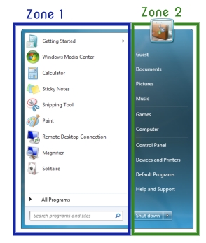
The screen shot reveals two main zones. The first zone contains a list of frequently used applications. You can also switch this zone to display the entire list of applications. The second zone contains a list of folders, providing you with access various parts of your computer. The most important flaw in this interface design is the scrolling.
This is because the speed of working with the interface is determined by several parts, the most important of which are the size of the interface element, the speed of moving the cursor to the element, the speed of visually understanding the element, and the speed of visually searching it.
When scrolling you have to alternately use the scroll bar and then visually inspect the menu, repeating this step several times, and upon finding the application you have to put the cursor over the application folder, click, move the cursor to the name of the application, and then click again.
This complex procedure can be considerably sped up if the menu uses the entire screen, as it did in Windows ХР. This makes it very fast to visually search the menu by cutting down the time spent scrolling.
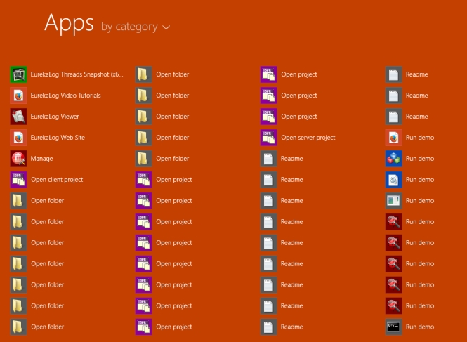
In Windows 8 we saw an attempt to solve this problem. The menu began using the entire screen, but the developers made the icons so large that scrolling was required once again. In order to quickly launch applications, the developers moved them out of folders, but they moved other files out too, which increased the mess and led to chaos. This was like an attempt to copy the one-click launch feature of Start Menu X. But missing the point of the single-click idea, Microsoft's implementation made the interface worse.
Public opinion and user requests to return the menu forced Microsoft to look for a way out. As I have written previously, the main objective of Windows 8 and Windows 10 is to force you to use the new apps. Let's consider the interface solutions employed to this end.
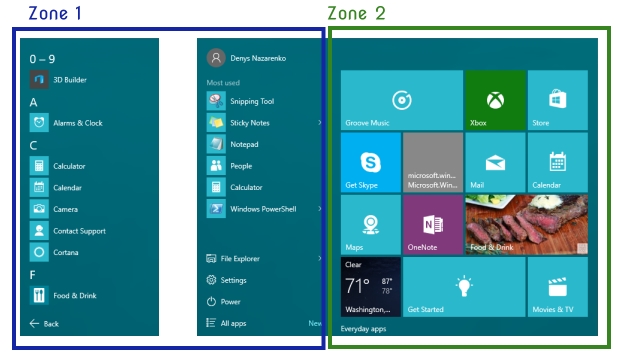
In the new menu, there are two separate zones. The first zone, as in Windows 7, contains a list of popular applications and can be switched to include all applications. The second zone no longer contains folders. It contains apps instead. Thus, the menu essentially contains apps on both sides. Like a car with two steering wheels. But where are the folders? They're tucked far away in the trunk. So if you suddenly want to open My Documents, you have to take a bunch of extra steps.
Both zones require scrolling and have the same problems described for the Windows 7 menu, since they are actually just tweaked versions of that menu. In other words, to the detriment of the interface Microsoft is trying to force you to switch to apps.
Let's examine the proper design for a new and user-friendly menu - What's the right way to make the Windows 10 menu?


