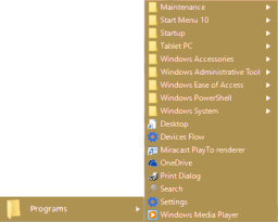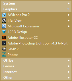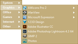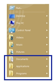
Let's put our heads together to figure out what the menu should look like. We'll begin with the menu as a concept. In my view, the menu is the sole point of access to anywhere on your computer. You should be able to accomplish task anything by clicking the start button. That's why it's always accessible. The menu should let you access any system folder. Let's have that be half of the menu. We've absolutely got to have a menu item for applications and documents. For convenience, we can split the applications and apps into separate folders or combine them, depending on settings.
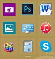
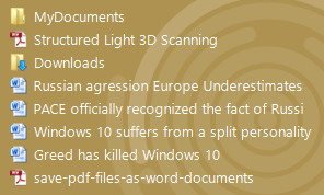
For quick access to frequently used applications, we'll put them in the menu as large icons that can be easily clicked. Not only should the list contain popular applications, but it should also be smart enough to show applications that were recently launched. Let's also add recently used documents.
Now let's see how we can avoid scrolling. We'll have the contents of each folder open on the entire screen.
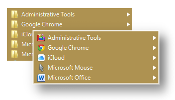
For pro users, we'll add virtual groups. Let's keep the office and graphics applications separate. Professionals have hundreds of applications and it's much easier to find them when they're in groups. But let's keep going and make virtual groups for all folders. The result is a convenient menu that takes advantage of principles of human cognition.
You spent only a few minutes to read this text in order to design and create a truly user-friendly menu. It's taken me ten years. And it's based on the experience of millions of users. In these 10 years I've responded to more than 43,000 emails.
